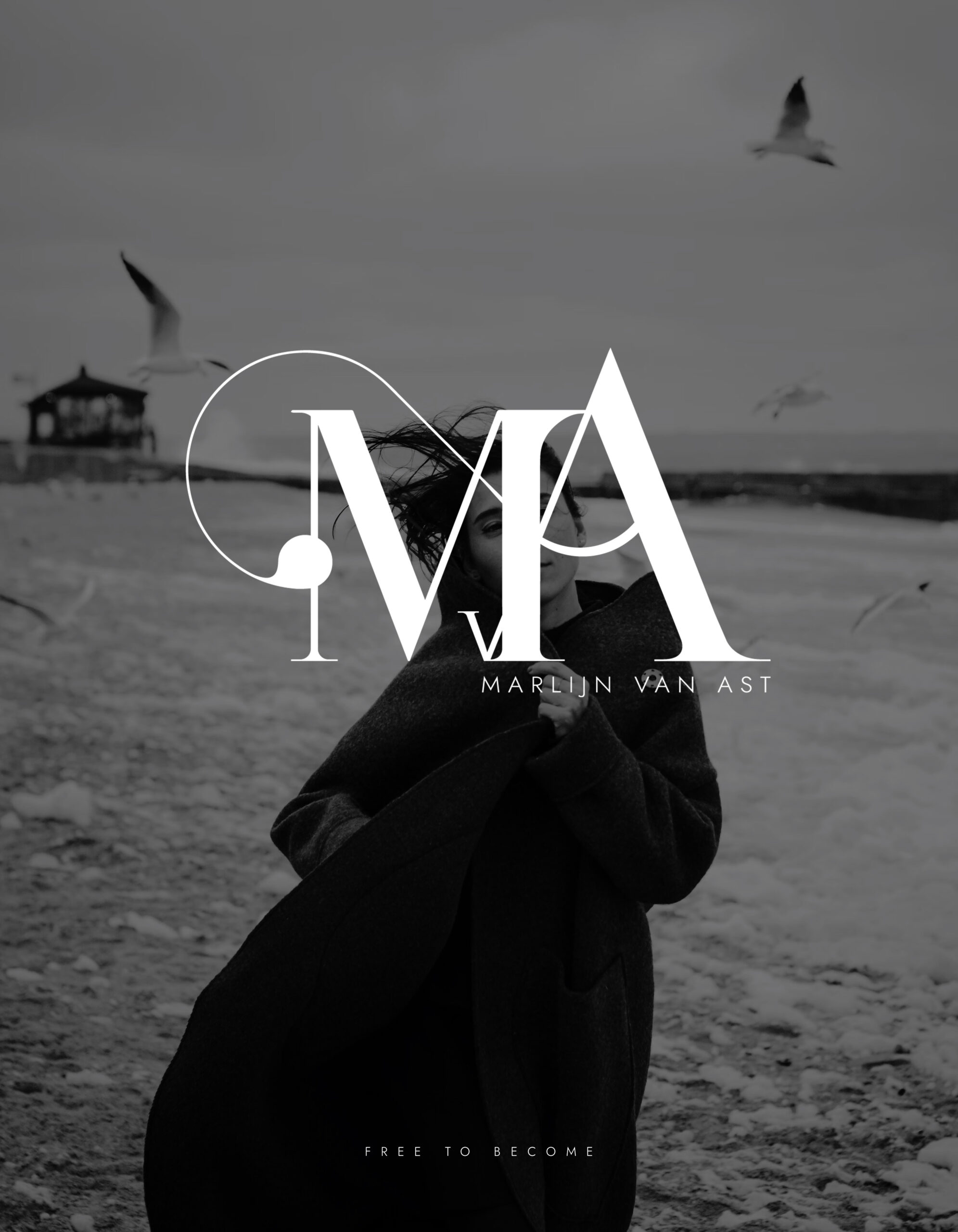
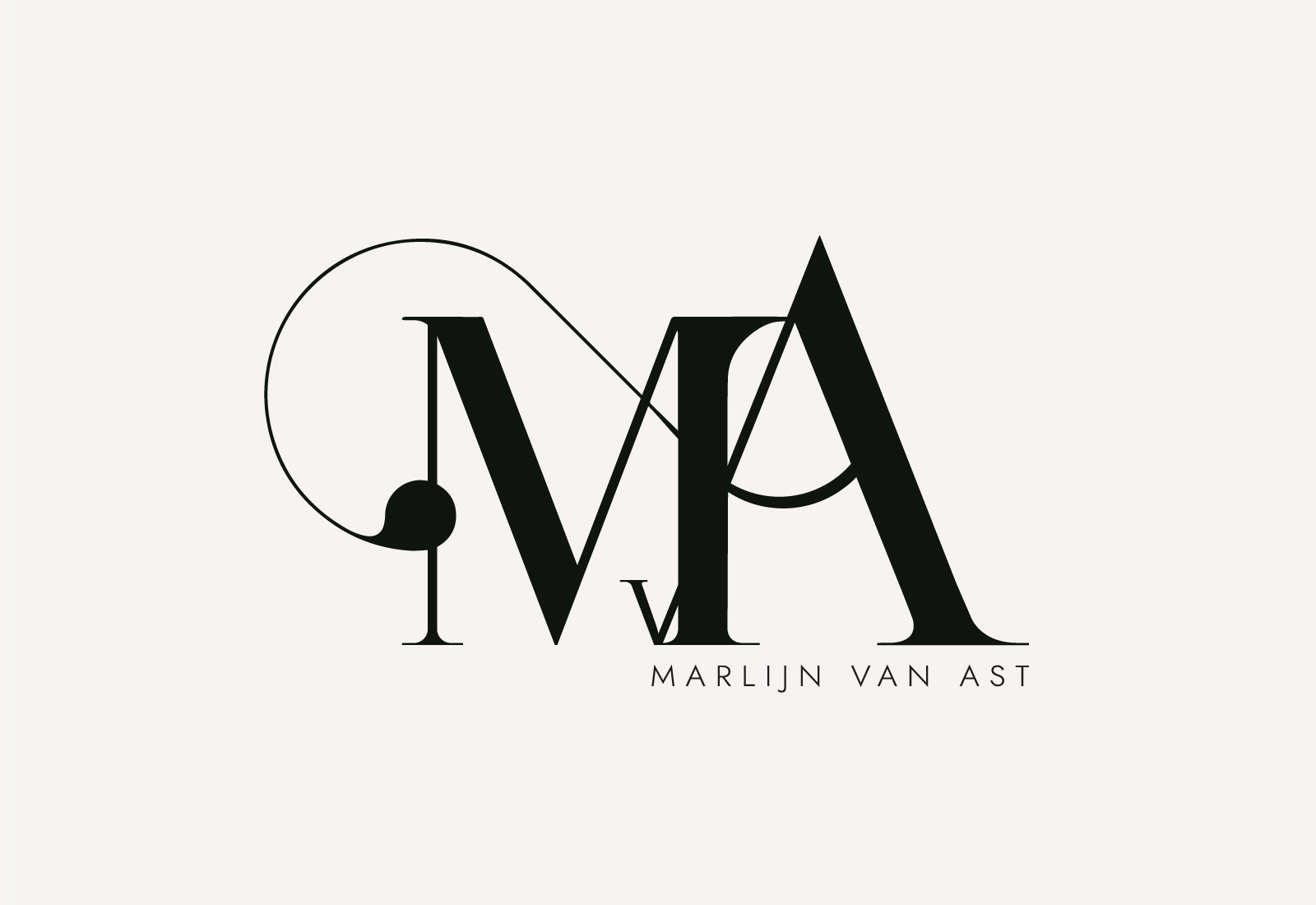
This logo design embodies the idea of a personal journey — an articulated, flowing path in continuous motion. It reflects the ups and downs, twists and turns that define growth, evolution, and identity.
The typography expresses stability and strength: large, wide-based letters evoke a solid foundation — firm and difficult to shake. This grounded structure visually communicates confidence, persistence, and rebirth.
Within this strength, a subtle but significant detail emerges: the “v” reveals a touch of vulnerability and delicacy. It partially hides, yet remains visible — a quiet reminder of human fragility that coexists with strength.
This contrast between power and sensitivity is central to the concept. It turns the logo into a symbolic emblem of balance, emotional depth and transformative resilience.
This is not just a logo — it’s a story told through design. A visual narrative of identity, evolution, and quiet power.
This logo has been honored with selection by the prestigious DesignRush Awards 2024–2025 as one of the “Best Emblem Logo Designs” of the year — a recognition granted by one of the leading platforms in the design and branding industry.